Average working hours in a week according to OECD
Final Visualization project by Matan Fintz and Konstantin Streshinsky
How to read and use it?
Read :
There are 3 key aspects to help you read the chart easily
- Size: if using the Descending order - the bigger the bubble -> the higher the value if using the Ascending order - the bigger the bubble -> the lower the value
- Color: use the legend on the left to know the bubble's size (which means-value) comparing to the others in the group.
- Location:as you can see the chart can be divided to 3 groups : places 2-7, 8-19 and 20-42 . - The middle bubble in is the one who ranked first,and the final bubble ranked last.
- On every group(dotted cycle) if you go clockwise the bubble's rank is going down,starting at 12 O'clock.
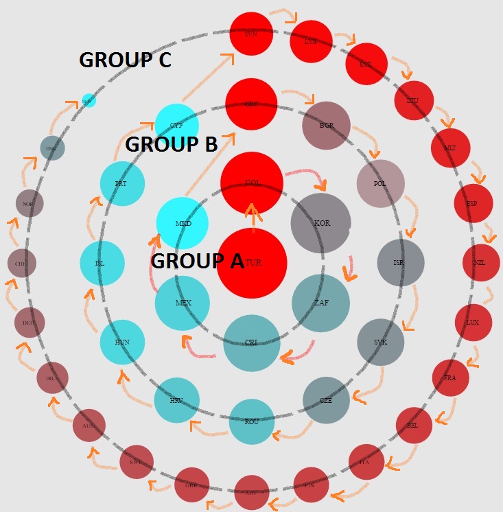
Note that you can always hover over the bubble to see it's full details.Staying over a bubble will give the general rank too.
Use :
Use the radio buttons on the top right of the page for your choices
- Order: Choose Descending or Ascending to order the bubbles as you prefer.
- Explore:There are 5 different atrributes you can filter the data by,giving 450 different outcomes !